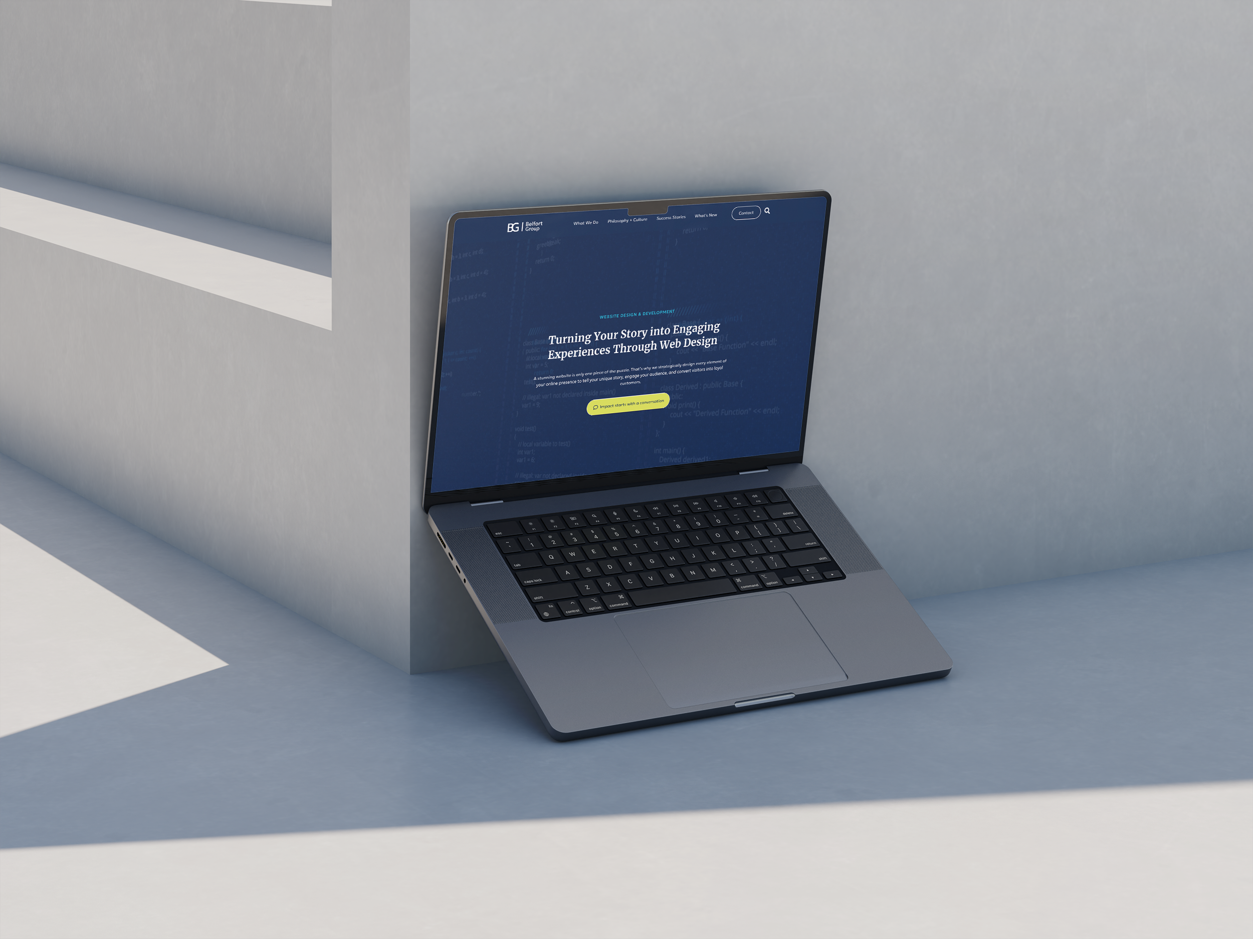
We’re thrilled to announce the recent launch of BG’s new and improved website—a project that has fueled excitement throughout our entire team. Our new website isn’t just a simple update—it’s a complete transformation. From its captivating design to an array of innovative features, every aspect has been carefully crafted to elevate the user experience and embody the essence of the BG brand.
Behind the scenes, our dedicated web team, led by Heather Weir and Peter Bates, has been instrumental in bringing this vision to life. Their expertise and commitment have been pivotal in shaping our digital presence, and we’re incredibly grateful for their contributions.
We recently caught up with Heather and Peter to gain insight into the journey behind the development of BG’s refreshed website. From the initial brainstorming sessions to the final tweaks before launch, they shared their insights and experiences every step of the way. Here’s a glimpse into their process and the inspiration behind our exciting new website.
Can you walk us through the design process and explain the inspiration behind the new design and layout of the BG website?
Heather: The design process was a collaborative effort. We mocked up multiple design concepts for the new website on a shared Adobe XD project. The platform allowed us to work together and add interactive elements to really show how we envisioned the new site behaving. Taking our favorite concepts, we presented them to the agency and created one new version that was close to the final version you see live today. This process allowed the web designers to collaborate closely, think outside of the box, and present to the stakeholders a true blueprint of the new website design before diving into development.
The insights we gathered during discovery also helped us identify what direction we wanted to go in – BG was looking for something professional, fresh, and dynamic. The team was excited about incorporating the agency’s recent rebranding to the new site designs. The rebrand introduced refreshed colors, fonts, and design elements.
Peter: We had a clear goal in mind when beginning the process of redesigning BG’s website; to truly and accurately reflect the agency we had become. We knew what we didn’t like about our previous site and used that as our starting point. This iteration needed to be more visually engaging, more interactive, and more flexible. Our agency grows and changes every day and we needed a website that could grow with us.
What obstacles did you face during the development process and how did you overcome them?
Heather: One challenge we successfully addressed was finding the right balance between showcasing our services and highlighting the industries we serve. Recognizing the importance of both, we conducted a strategic analysis using analytics from the existing website. To optimize user experience, we decided to prioritize our services while implementing intuitive navigation options. Leveraging taxonomies and tags, we created specialized landing pages that can be leveraged by the agency for various marketing initiatives.
Peter: Challenges are inevitable in any project. However, being prepared for those limits any potential disruptions. Effective communication, team collaboration, and an adaptive mindset are all keys to our success in overcoming obstacles as they arise.
Can you explain the user experience (UX) and how it played a role in your design process? How do you guarantee a positive user experience for website visitors?
Heather: The user experience was a high priority in our design process. We wanted to make sure relevant information was easily accessible to our audience. We strategically placed our core practice areas beneath the fold of the site, allowing visitors to quickly navigate to the content more relevant to them. We also incorporated a mega menu further streamlining the user’s journey.
Peter: Understanding our target audience and how they would ultimately use the site served as our guidepost. Good user experience design ensures that users can easily navigate, understand, and interact with the site. So by creating prototypes to test the flow and functionality of the site, ensuring the consistent use of responsive and intuitive elements, as well as conducting usability testing with real users, we were able to ensure this newest iteration of BG’s website yielded a positive user experience every time.
What new website features are you most excited about?
Heather: I’m excited about the introduction of featured tag pages. These collections of posts, case studies, and pages categorized under specific tags can be easily accessed through the mega menu when hovering over ‘What We Do.’ This addition provides our visitors with another convenient access point to relevant and categorized information including niche service items and industries.
Peter: The feature I’m most excited about is the interactive content. From quizzes and polls to video and podcasts this new site supports a much wider range of content and allows us to create more unique and engaging experiences for users.
In the constantly evolving field of web design, how do you stay up to date with the latest design trends and technologies?
Heather: To stay up to date, I try to keep up with patch notes for my most used tools and platforms when updates occur. This helps me utilize my tools to its fullest potential and gives me good indicators of what’s trending within the industry. For design inspiration, I like to browse award-winning websites found on websites like Awwwards and The Webby Awards.
Peter: For me, hands-on experience is crucial. Regularly undertaking personal or small projects where I am able to experiment with new design trends and technologies is a vital part of how I stay engaged in a field that evolves as much as web design does.
Ready to begin on your own website journey? Let our team of experts assist you! Reach out to us at creative@thebelfortgroup.com to start your project today. Visit our website services page to see how we can bring your vision to life, just like we did with ours.


